Mobile app
Redesign onboarding process for beginner investors


Project Description
Raiffeisen Bank in Russia offers an investing app for private users. Despite the growing interest in investing, many people lack knowledge about basic terms, rules, and market features. My goal was to enhance the learning process by adding explanatory materials to the existing application, making it more user-friendly for beginners while keeping it efficient for experienced users.
As a UI/UX Designer, I followed the Raiffeisen Bank's iOS design system to improve usability and accessibility. I focused on understanding user needs, identifying pain points, generating ideas, creating prototypes, and testing new features.
From explorations to final designs in 5 weeks while working with multiple projects at the same time.
Problem Statement
There were initial hypotheses about potential issues newcomers faced when using the app:
Most of users felt intimidated to even open the app after downloading it, as it was unclear how to navigate and use its features.
Many users faced challenges locating specific financial information or navigating through menus and screens due to unintuitive design and unclear instructions.
Experienced investors found themselves overwhelmed by visual clutter and unnecessary elements that diverted their attention.
Users reported difficulty accessing bank representatives, which made it challenging to resolve onboarding issues, app errors, and other related concerns.


Solution
Based on the problem findings, here are some of the solutions implemented:
Content
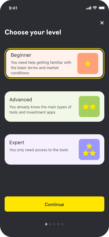
Developed a new onboarding process featuring clear navigation and detailed explanations.
Integrated tutorials and tips designed for beginners.
Enhanced engagement for new users, fostering the development of investing habits.
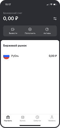
Navigation and User Interface
Integrated clear instructions and visual cues to assist users in navigating the app's menus and screens.
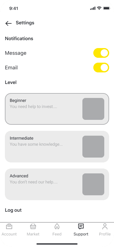
Visual Noise
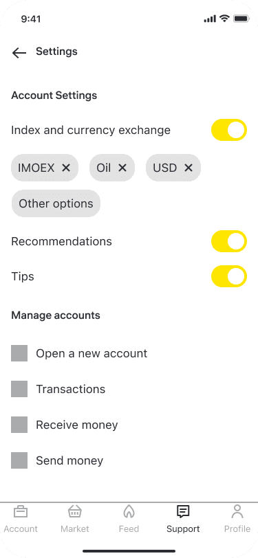
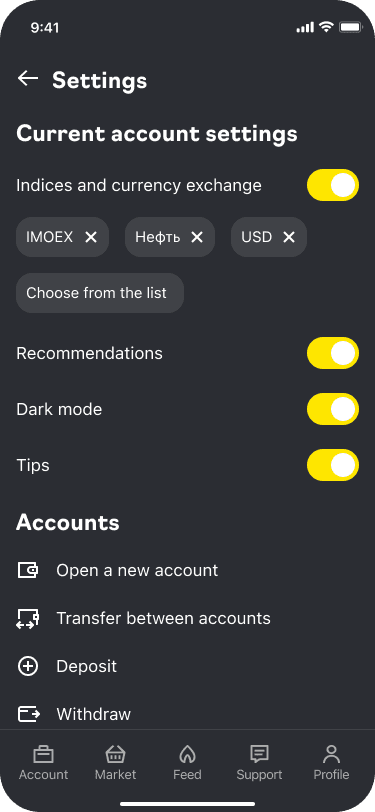
Enabled experienced investors to deactivate unnecessary tips and recommendations.
Assistance
Passed on observations to the team responsible for user support, enabling them to develop solutions for providing special recommendations on trading strategies, accounts, bonds, major companies, and more.
High-Fidelity Prototype


I placed static screenshots below the carousel to highlight areas with multiple changes, allowing you to better grasp the depth of the redesign and explore the detailed improvements.


Outcome
This project focused on improving the user experience of the Raiffeisen Bank Investments app. The proposed solutions aimed to enhance user retention and attract new users by improving accessibility and lowering the entry barrier.
I designed app layouts incorporating these ideas, developed interactive prototypes, and conducted hallway testing with typical user scenarios, such as onboarding and first-time app use.
The testing results showed that our solutions—onboarding, tutorials, and in-app tips—positively impacted the user experience. My case study was selected as the winning project among submissions from the Yandex Practicum UX/UI Design Bootcamp and was handed over to the Raiffeisen Bank design team for further development. I hope you found this case study insightful as well.