Desktop & Mobile App
Developed a mobile & web design system for a SaaS startup

Project description
The project focused on building a scalable and cohesive design system from the ground up for a growing U.S.-based SaaS startup specializing in AI-driven analytics tools. Through an iterative, step-by-step approach, the system evolved from an initial concept to a fully implemented web version, enhancing efficiency across the company. The primary objectives were to establish a unified visual language, improve design consistency, and streamline product development across multiple teams. Additionally, the system was designed to be flexible, supporting future product expansion and an evolving brand identity. While the startup serves several thousand active users, an NDA prevents disclosing its name.
The project spanned three months and was structured into distinct phases:
Analyzing Existing Visual Components
Planning and Prioritization
Building a Web-Based Design Library
Final Project Review
As the Product Designer, I was responsible for the design, documentation, and implementation of the design system. My role also included collaborating with developers, product managers, and other stakeholders to ensure seamless integration.
Challenges
Lack of a unified design language across different platforms.
Inconsistencies in UI components and interactions.
Inefficiencies in design and development due to repetitive work.
Difficulty in scaling design efforts as the company grew.
Lack of accessibility considerations in the existing UI.
Objectives
Develop a comprehensive design system with reusable components.
Ensure consistency in branding and user experience.
Improve collaboration between designers and developers.
Reduce design debt and accelerate the product development cycle.
Establish accessibility guidelines to ensure an inclusive user experience.
Key outcomes and results
Designed 45 responsive components with multiple states and variants.
Developed a comprehensive design system from 0 to 1, including typography, color schemes, and iconography.
Created 12 new UI patterns with enhanced accessibility and consistency.
Conducted usability testing and iterated several features based on user feedback.


Analyzing existing visual components
To establish a baseline for the design system, I conducted a thorough UI audit. I reviewed all existing UI elements across different products; identified inconsistencies in typography, spacing, and interactions; conducted accessibility tests to pinpoint issues related to color contrast and usability.
Multiple variations of similar UI elements caused inconsistencies.
Lack of documentation led to misalignment between design and development.
Some components did not meet accessibility standards.
Conducted a full UI audit to catalog and assess existing components.
Identified redundant elements and created a strategy for consolidation.
Ran accessibility tests to determine necessary adjustments.
The research confirmed that a structured design system would significantly improve workflow efficiency, consistency, and accessibility, ultimately benefiting both the user experience and internal processes.
Planning and prioritization
With insights from the audit, I created a structured roadmap for the design system. This included defining core principles and prioritizing components based on impact and feasibility.
Unclear hierarchy of design needs.
Development team lacked clear adoption guidelines.
Tight timeline for implementation.
Defined core design principles and framework (e.g., atomic design approach).
Prioritized key components based on usability impact and development feasibility.
Created a phased rollout plan for smoother adoption.
Users report significant time savings and improved productivity through optimized scheduling recommendations.
Building an app-based design library
I then focused on developing a centralized design library that would serve as a single source of truth for designers and developers. I created a structured Figma file with standardized UI components; established a design token system for colors, typography, and spacing; wrote documentation to ensure proper usage and implementation.
Built a structured component library in Figma.
Integrated design tokens for consistency in colors, typography, and spacing.
Developed extensive documentation with usage guidelines and best practices.
Adopted an atomic design approach for better modularity and reusability.
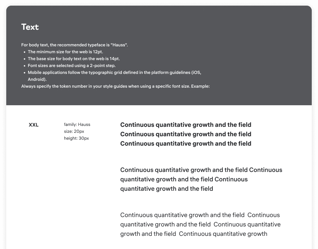
Standardized typography and spacing rules to create a harmonious design language.
Implemented a flexible color system that supports light and dark modes.
Integrated accessibility standards (WCAG compliance) in every component.
Buttons


Testing and validation
To ensure the design system’s success, I organized a final review phase that involved testing, validation, and onboarding sessions.
Conducted A/B testing on key components to evaluate performance.
Ran internal usability tests with designers and developers.
Implemented real-world testing in a beta environment before full rollout.
Color accessibility adjustments were made based on contrast testing.
Component flexibility improvements allowed for better responsiveness.
Documentation refinements provided clearer guidelines for implementation.
Reduced design inconsistencies by 80%.
Increased design-to-development efficiency by 50%.
Standardized components across 5+ products within the company.
Improved accessibility compliance, making the product more inclusive.
Outcome
Here, the outcomes and achievements of the project are highlighted, including user feedback, adoption rates, and industry recognition.
Early collaboration with developers prevents integration issues.
A strong documentation strategy ensures system adoption.
Continuous iteration and maintenance are key to long-term success.